
.jpg)
.avif)
.avif)
.avif)
.avif)
.avif)
.avif)
.avif)


.avif)
.avif)
.avif)
.avif)
.avif)
.jpg)
.avif)
.jpg)
.jpg)
.jpg)
.jpg)
.jpg)
.jpg)
.jpg)
.jpg)

.avif)
.avif)
.avif)
.avif)
.avif)


.avif)
.avif)
.avif)
.avif)
.avif)
.avif)
.avif)
.avif)
.avif)

.avif)
.avif)
.avif)
.avif)
.avif)
.avif)

.avif)


.avif)
.avif)
.avif)
.avif)
.avif)
.avif)
.avif)
.avif)

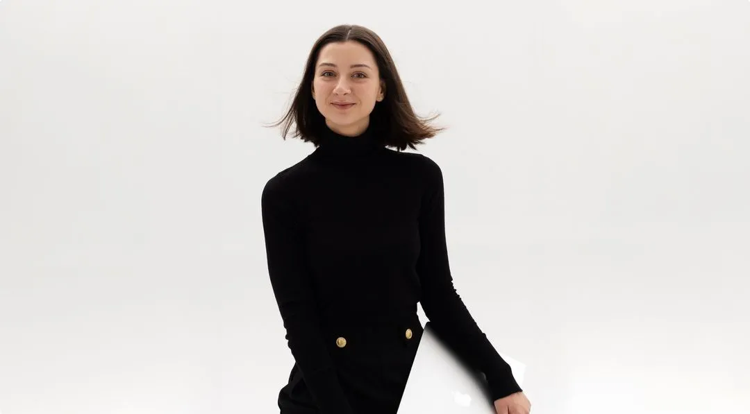
Karyna Movsha
Product Designer
Currently
Open to roles
Focus
Product Design
Location
from Ukraine
based in Poland
Product Designer · 6+ years
Product Designer with 6+ years building and scaling digital products across PropTech, fintech, and SaaS
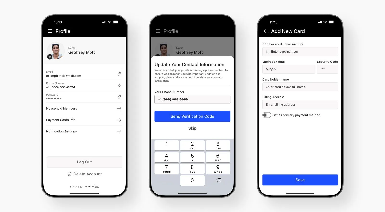
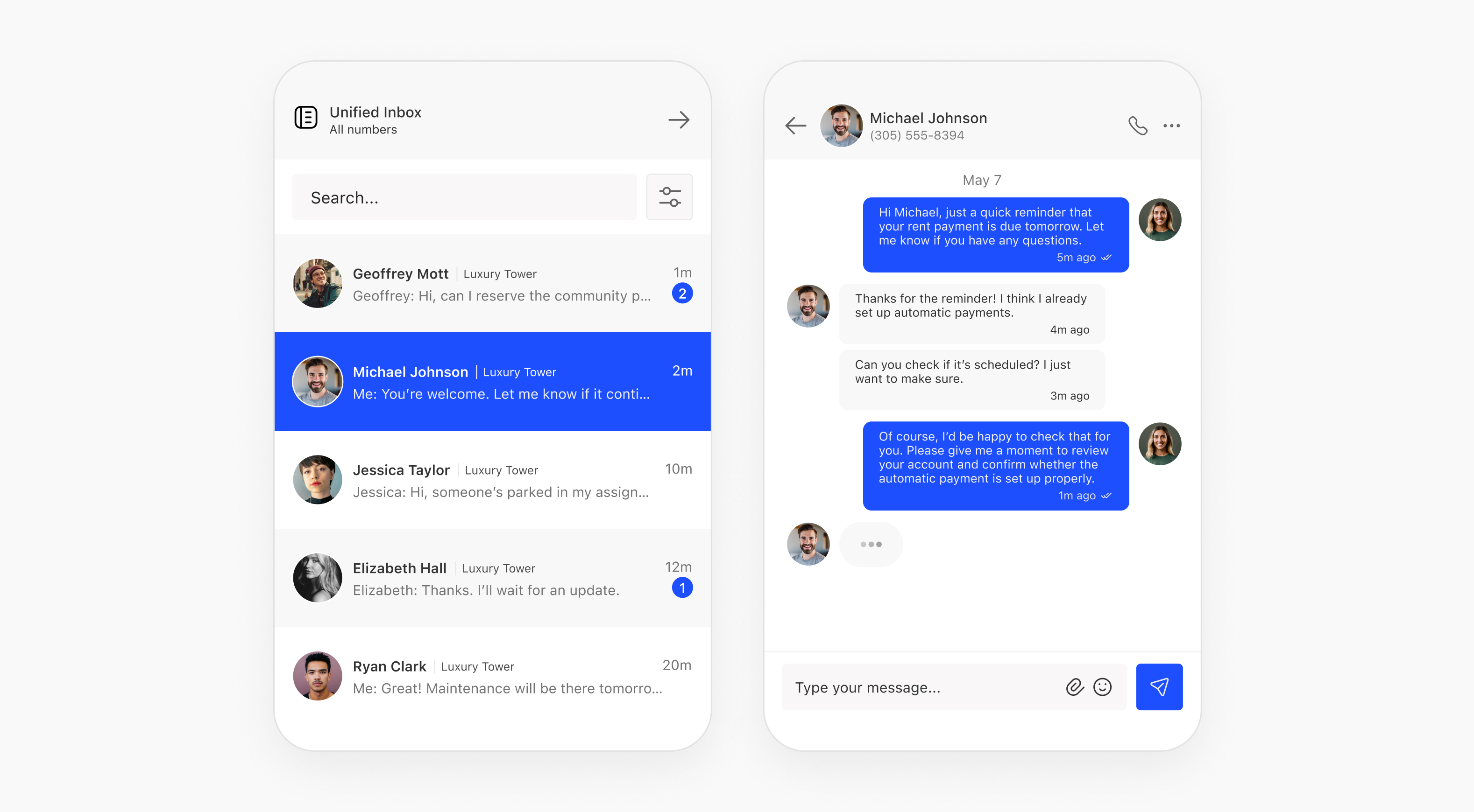
Sole designer for a platform serving 200,000+ managed residential units, and founder of a profitable Webflow template business with 600+ sales in its first year. I work end to end — research and information architecture through to hi-fi UI, design systems, and production builds in Webflow and Claude Code.
.avif)

.jpg)
.avif)
.avif)
.avif)
.avif)
.avif)
.avif)
.avif)
.avif)
.avif)
Studio Work
Loonis Studio
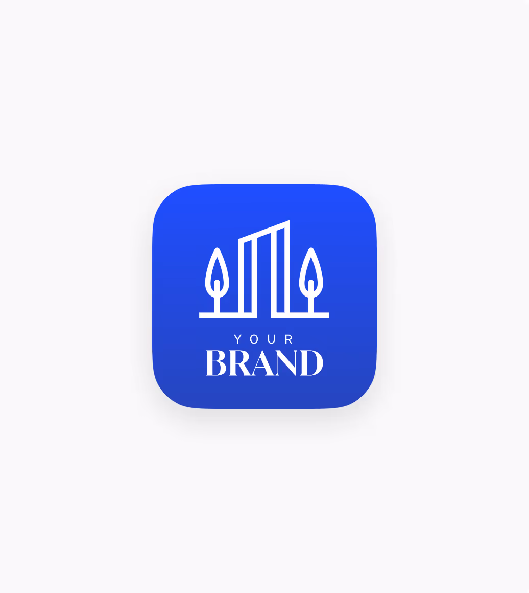
In 2025 I founded Loonis Studio alongside my product work, a Webflow template business with 20+ published templates and 600+ sales in its first year. Systematic UI design at scale across 8 B2B verticals, shipped as production-ready products. It lives at its own URL because it tells its own story.